Nouvelle Noire
×
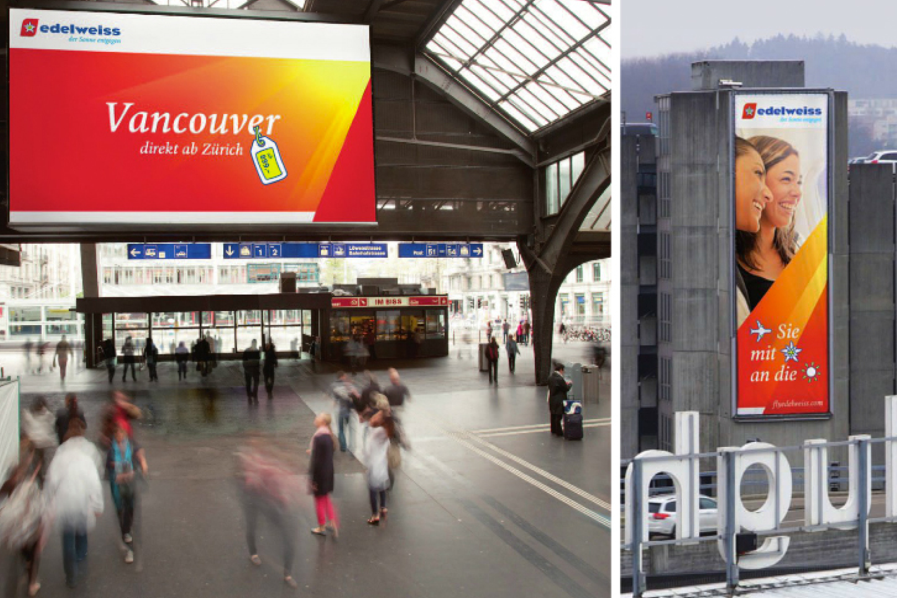
Edelweiss
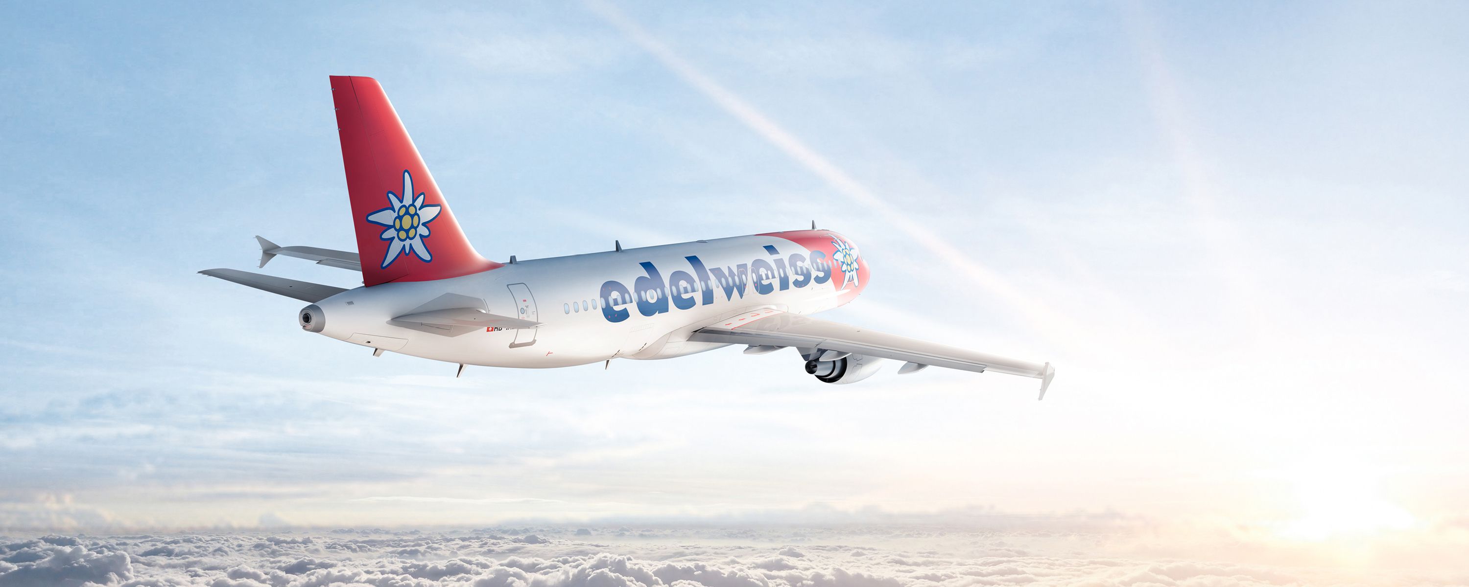
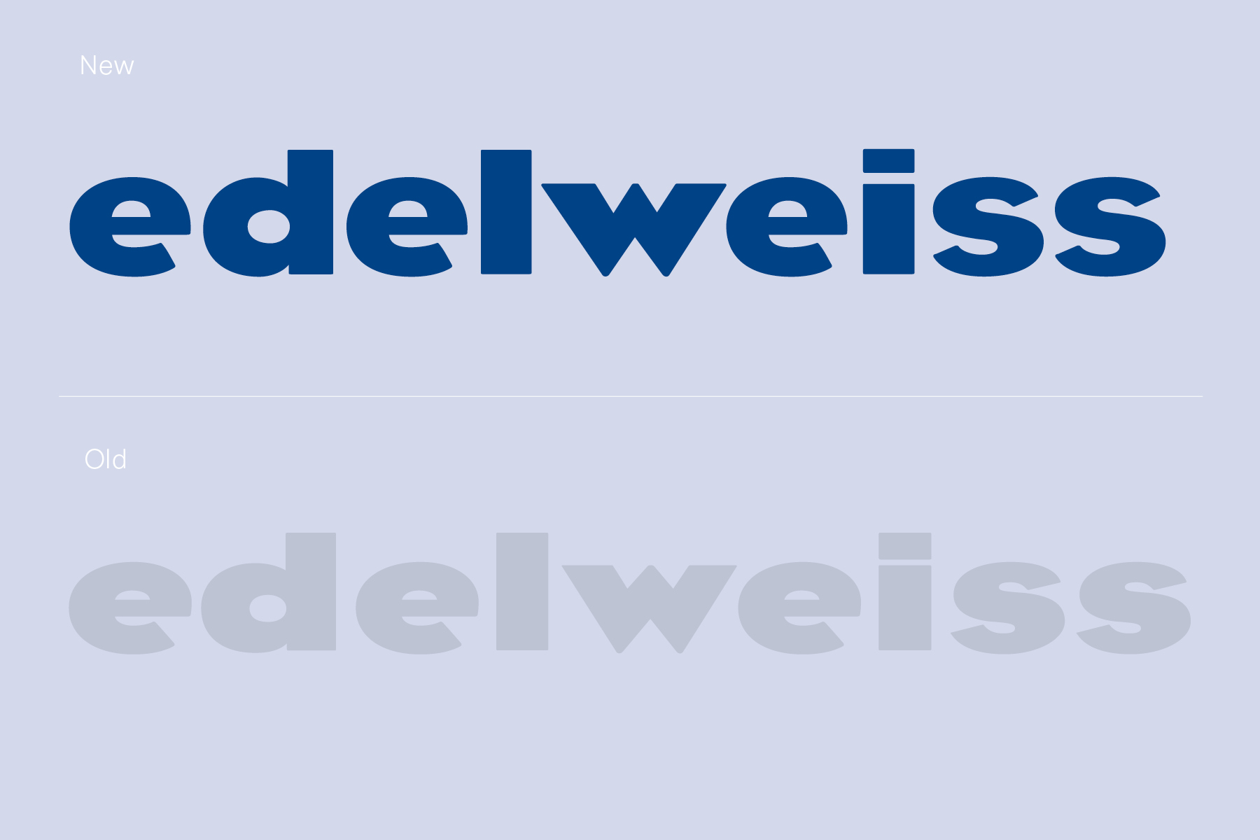
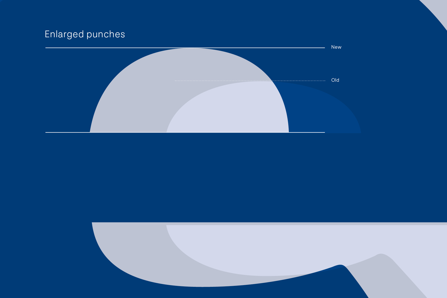
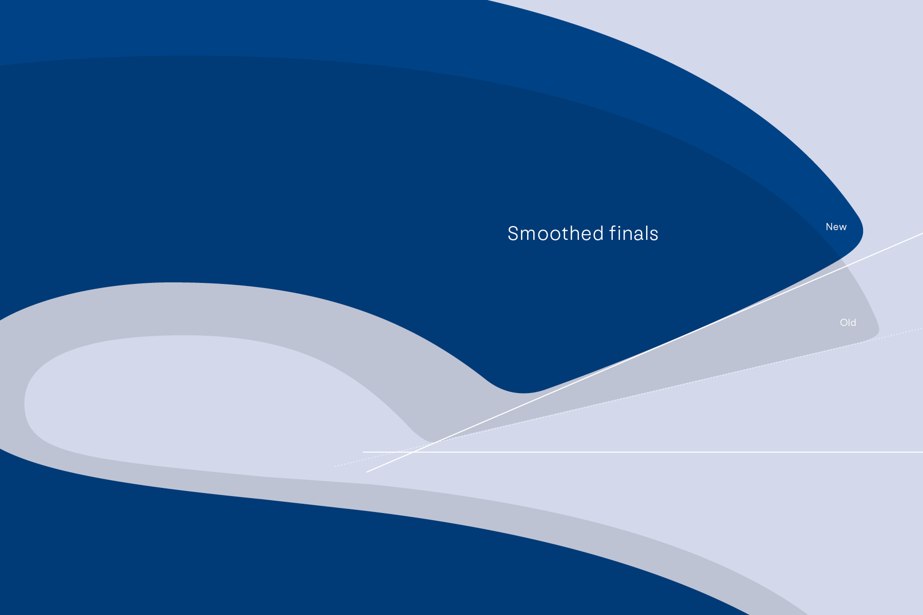
On the occasion of the rebranding of the Swiss airline ‘Edelweiss’ the brand consultancy agency Process Group asked us to redraw the existing logotype. The goal was to subtly redesign the letters so that the company clients wouldn’t notice a significant difference. In terms of design, the logotype should look friendlier, more up to date and be legible in small sizes. The challenge was to keep the current style and turn the severely stretched letters into a harmonious and fresh logotype.
Any questions?
Clovis Vallois, our type director,
loves to help you.
Say hi via mail, and let’s have a chat.