• A

    • A

ABCDEFGHIJKLMNOPQRSTUVWXYZ abcdefghijklmnopqrstuvwxyz & (Ää Éé Øø) {@©®} [!?“”«»*] ←
Nouvelle Grotesk Thin
ABCDEFGHIJKLMNOPQRSTUVWXYZ abcdefghijklmnopqrstuvwxyz & (Ää Éé Øø) {@©®} [!?“”«»*] ←
Nouvelle Grotesk Thin Diagonal
ABCDEFGHIJKLMNOPQRSTUVWXYZ abcdefghijklmnopqrstuvwxyz & (Ää Éé Øø) {@©®} [!?“”«»*] ←
Nouvelle Grotesk Light
ABCDEFGHIJKLMNOPQRSTUVWXYZ abcdefghijklmnopqrstuvwxyz & (Ää Éé Øø) {@©®} [!?“”«»*] ←
Nouvelle Grotesk Light Diagonal
ABCDEFGHIJKLMNOPQRSTUVWXYZ abcdefghijklmnopqrstuvwxyz & (Ää Éé Øø) {@©®} [!?“”«»*] ←
Nouvelle Grotesk Normal
ABCDEFGHIJKLMNOPQRSTUVWXYZ abcdefghijklmnopqrstuvwxyz & (Ää Éé Øø) {@©®} [!?“”«»*] ←
Nouvelle Grotesk Normal Diagonal
ABCDEFGHIJKLMNOPQRSTUVWXYZ abcdefghijklmnopqrstuvwxyz & (Ää Éé Øø) {@©®} [!?“”«»*] ←
Nouvelle Grotesk Medium
ABCDEFGHIJKLMNOPQRSTUVWXYZ abcdefghijklmnopqrstuvwxyz & (Ää Éé Øø) {@©®} [!?“”«»*] ←
Nouvelle Grotesk Medium Diagonal
ABCDEFGHIJKLMNOPQRSTUVWXYZ abcdefghijklmnopqrstuvwxyz & (Ää Éé Øø) {@©®} [!?“”«»*] ←
Nouvelle Grotesk Bold
ABCDEFGHIJKLMNOPQRSTUVWXYZ abcdefghijklmnopqrstuvwxyz & (Ää Éé Øø) {@©®} [!?“”«»*] ←
Nouvelle Grotesk Bold Diagonal
ABCDEFGHIJKLMNOPQRSTUVWXYZ abcdefghijklmnopqrstuvwxyz & (Ää Éé Øø) {@©®} [!?“”«»*] ←
Nouvelle Grotesk Black
ABCDEFGHIJKLMNOPQRSTUVWXYZ abcdefghijklmnopqrstuvwxyz & (Ää Éé Øø) {@©®} [!?“”«»*] ←
Nouvelle Grotesk Black Diagonal
ABCDEFGHIJKLMNOPQRSTUVWXYZ abcdefghijklmnopqrstuvwxyz & (Ää Éé Øø) {@©®} [!?“”«»*] ←
Nouvelle Grotesk Fat Diagonal
Designer:

Anton Studer

Release:

2020

Version:

1.0

Specimen:

Detailed character set, language support, Opentype features, and additional information can be found here.

The success story of the Grotesque typefaces began at the dawn of the 20th century with typographic workhorses such as Akzidenz Grotesk and Aurora Grotesk amongst others. In the 1950s Max Miedinger created the first Swiss version of those typographic multi-talents, named “Neue Haas Grotesk” (today Helvetica). In parallel, Adrian Frutiger published “Univers”, both globally recognized and becoming standard choices for designers. Over the years many amazing contributions have come in the form of Haas Unica, Theinhard Grotesk and Akkurat, just to name a few. Surprisingly the world hasn’t lost its appetite for Swiss Style Grotesque typefaces.

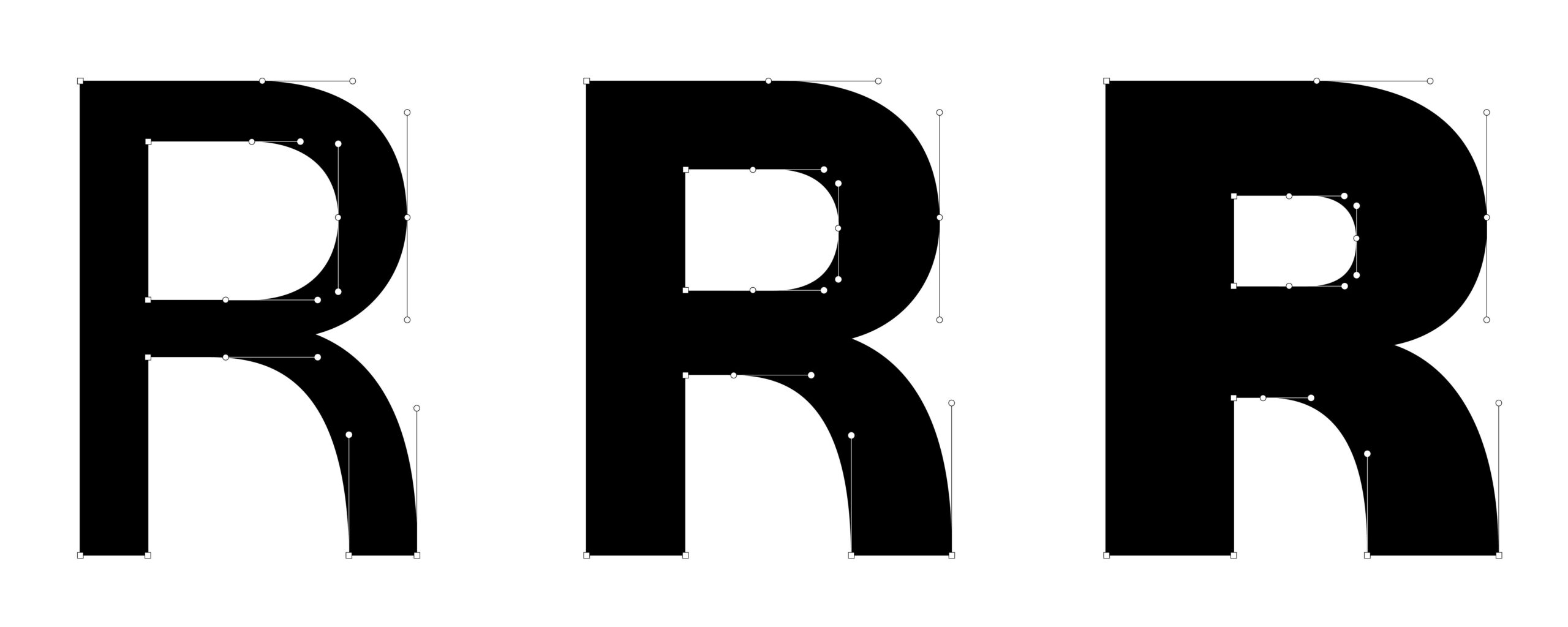
Seventy years after the start of this success story, we are ready to make a contribution to this ensemble of outstanding type families. It took us some time to find a perfect form that fills the gap between simplicity and neutrality. We didn’t want to design yet another “neutral” typeface. We have searched for shapes that are simple and which encourage the designer to create amazing things – and by the way, make other people smile. We call this type family Nouvelle Grotesk, celebrating a desire to keep just a tiny bit of the spirit of the original meaning “Grotesque” alive for years to come.


NN Nouvelle Grotesk Specimen

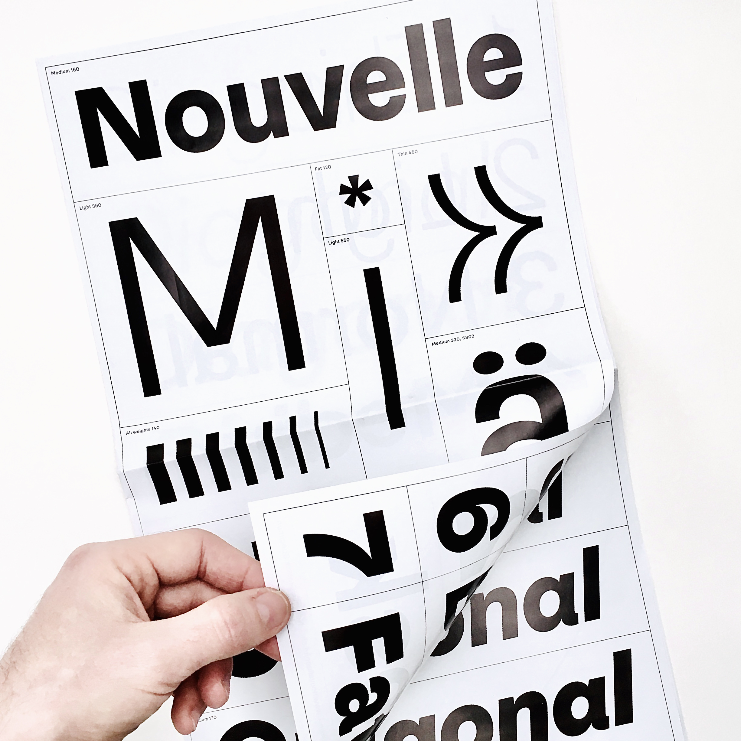
Get the NN Nouvelle Grotesk Specimen
Size: 42cm x 25cm
Paper: High Gloss, White, 90g/m2
Prize: 15.— CHF, incl. Shipping in Worldwide.
Printed: Jakob Druck, Switzerland
And: You’ll love it.

Just send us a mail to get your copy.